
One sports brand. Across web and print.
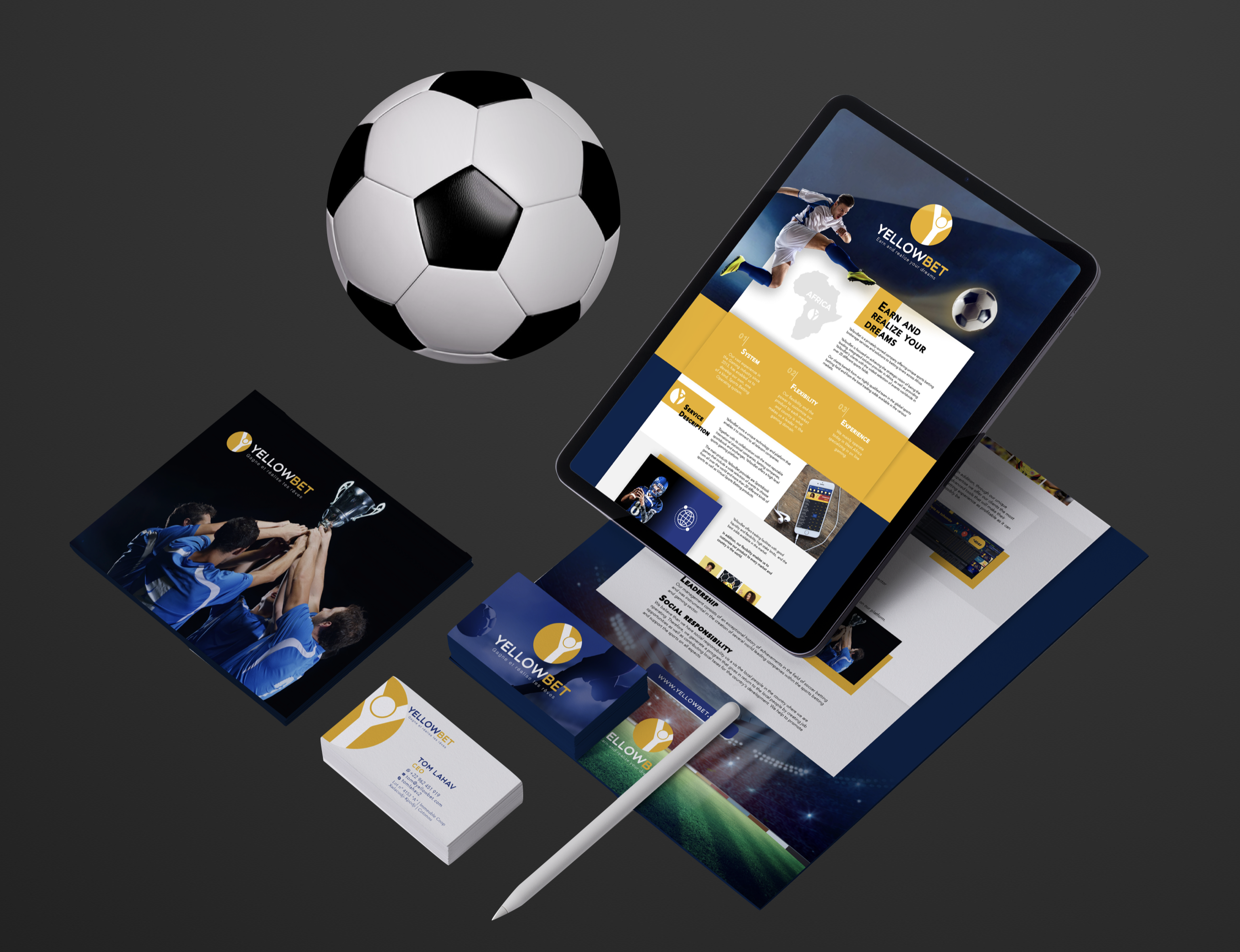
How do you keep a brand consistent across formats?
A logo, website, mailer and business card each serve a different purpose. The design task was to give Yellow Bet a recognisable visual language that could work across those formats.
Carry the identity through the work.
We developed the logo board and applied the brand’s visual language to the website design and business materials. Colour, typography and sports imagery connect the different applications.
Visual identity
A logo board with mark variations, colour and typography.
Website design
A website design that carries the brand’s identity into its digital presentation.
Mailer & business cards
Printed applications of the brand for business communication.
One identity.
Across the formats.
The logo, yellow-and-blue palette and typography connect the brand applications. The identity board shows the visual language alongside examples of its use.
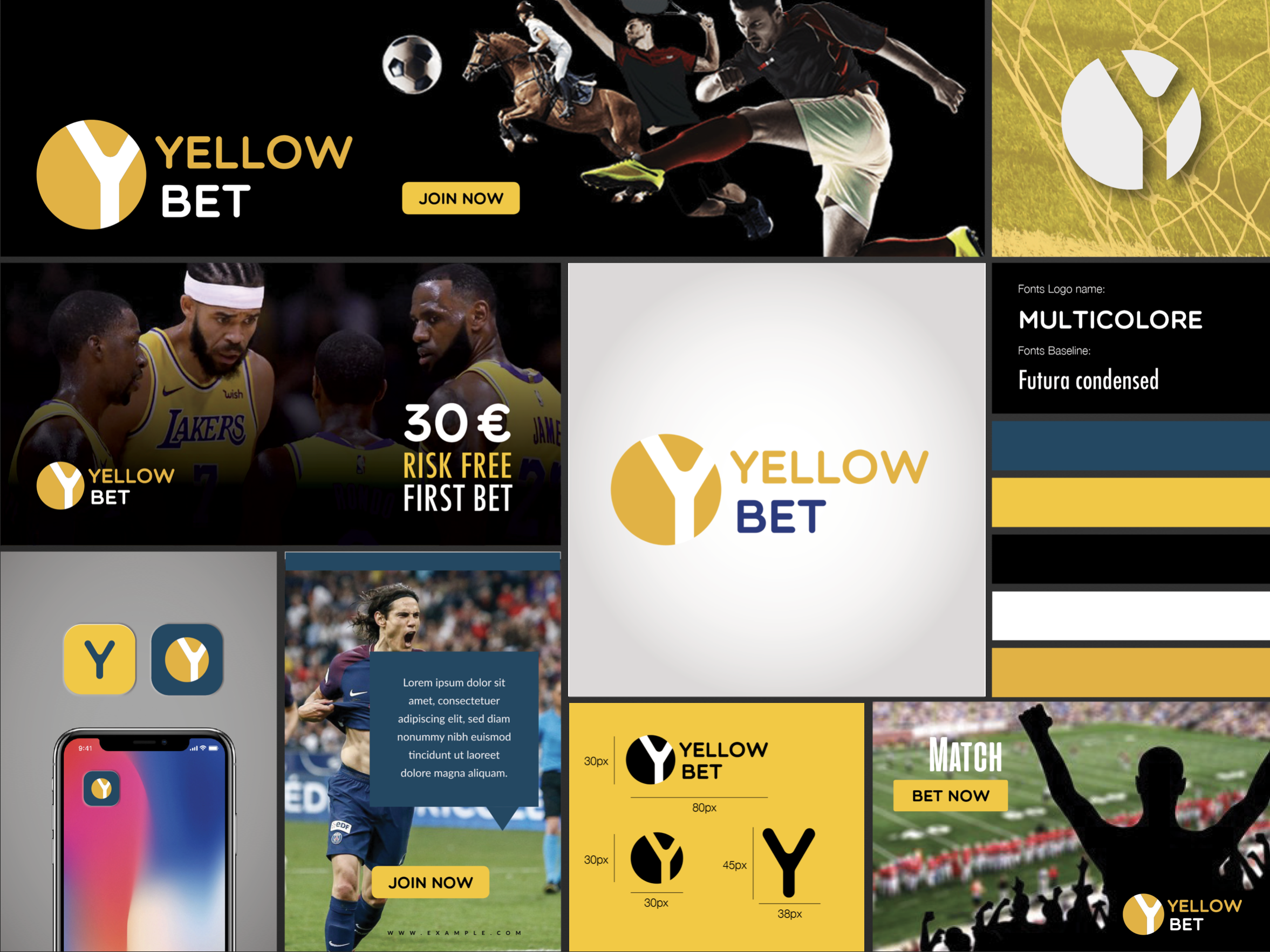
One brand, across the places it appears.
The identity board, website design and printed materials show the brand in different formats. The shared use of colour, type and imagery connects those applications.
Building a brand that needs to work across web and print?
Let’s Talk